
- Fixed prices, clear delivery
- Filter by style, budget and reviews
- Revisions on most gigs
Vetted designers or a creative contest. You walk away with source files and full ownership.
Pro designers
Hand-picked talent, every style.
You own it all
Source files, full commercial rights.
Built to scale
Vector files for web, print and merch.
Hand-picked alternatives. Pricing and terms set by each partner.

Independent third-party services. NextBrand may earn a referral fee at no extra cost to you.
AI logo makers, freelance designers, design contests, and full studios - what each one costs, what you get, and how to brief them so the logo actually works on a website, app and packaging.
A logo is the visual shorthand for your brand. Done well, it survives 10 years of resizing, recoloring, and placement on everything from a favicon to a billboard. Done poorly, it gets quietly replaced within 18 months. The good news: getting a great logo today is faster and cheaper than ever - if you choose the right path and write a clear brief.
This guide compares the four real options (AI logo makers, freelance marketplaces, design contests, and dedicated studios), shows what each one is best at, and gives you the questions a great designer will ask before they ever open a sketchbook.
At a Glance
Every customer touchpoint carries your logo: your website header, your app icon, your invoices, your email signature, your social profile pictures, your packaging. A logo that does not hold up at small sizes, in one color, or on a dark background creates friction at every one of these points.
Replacing a logo later is expensive in two ways. The obvious cost is the redesign itself. The hidden cost is the brand equity you abandon - the recognition you have built up across thousands of impressions. Founders who pick the wrong logo path early often pay twice: once for the cheap logo, and again for the proper one a year later.
The goal is not "a logo we like today". The goal is a logo that still feels right in three years, scales from favicon to billboard, and works in monochrome when a client prints it on a hat. That outcome depends almost entirely on the brief, not the budget.
Legibility at small sizes
It needs to read clearly at 16 by 16 pixels as a favicon. If the details collapse into mush, the logo is too complex.
Works in one color
A great logo holds up in pure black, pure white, and a single brand color. If it only works in full color with gradients, it will fail on merch, embroidery, and many print contexts.
Scales without breaking
The same mark needs to look right on a phone screen and on the side of a truck. Vector format (SVG) only. Never accept a logo delivered only as PNG or JPG.
Distinct from competitors
If the top 10 logos in your category all look the same, yours should not. Look at competitors before briefing your designer and explicitly call out what you do not want to look like.
Pairs with the right type
A logo is rarely just the mark - it is the mark plus the wordmark. The typography is half the system. A clean wordmark in the right font often beats a fussy icon.
Tools like Tailor Brands generate dozens of logo options from a few inputs (name, industry, style) in minutes. You can edit colors, fonts, and layouts in the browser and download vector files. Pricing is subscription-based (around 10 to 50 USD per month) or one-time purchase.
Best for: Pre-revenue testing, MVPs, side projects, and visual placeholders while you figure out the brand.
Platforms like Fiverr connect you to real designers across every budget. You see portfolios, ratings, and prior work before you hire. Pricing ranges from 30 USD for a quick mark to 2,000 USD+ for senior designers with a long process.
Best for: Founders who know the style they want and need one designer to execute it cleanly with 2 to 3 revision rounds.
99designs runs a brief out to dozens of designers worldwide. You get many directions to compare, pick a winner, then iterate with that one designer. Pricing is fixed (300 to 1,500 USD) and includes full ownership transfer.
Best for: Founders who are unsure what style fits and want to see the option space before committing.
A small studio or senior independent designer takes you through a full identity process - discovery, mood boards, multiple rounds, full guidelines. Typically 5,000 USD and up.
Best for: Funded companies, rebrands, or brands where the identity system (not just the mark) is core to the product.
| Path | Cost | Time | Output quality | Best when |
|---|---|---|---|---|
| AI logo maker | 30 to 80 USD | 15 minutes | Functional | You need a placeholder fast |
| Freelancer | 200 to 2,000 USD | 3 to 14 days | Good to great | You know what you want |
| Design contest | 300 to 1,500 USD | 7 to 14 days | Good to great | You want to compare directions |
| Studio | 5,000 USD+ | 4 to 8 weeks | Excellent | You need a full identity system |
Write your brand in one sentence
Who you serve, what you sell, and the single emotion you want the logo to project. "We help busy parents plan healthy weekday dinners and the logo should feel warm and competent." That sentence is more useful than any mood board.
Collect 5 to 10 references
Logos you love and logos you hate, ideally from outside your category. For each, write one line on why. References without reasoning create confused designs.
Name your hard constraints
Must work in one color, must read as a 16-pixel favicon, must not look like competitor X. Three constraints beat 20 wishes.
Specify deliverables
SVG, PNG (transparent), favicon, light and dark variants, social profile crops. Get these in writing before any work starts.
Plan two revision rounds, not five
Set the expectation that round one is direction, round two is refinement. Endless rounds dilute the work and frustrate the designer.
Test it before you finalize
Put the logo on a real website mockup, a real favicon, a real T-shirt mockup. A logo that only works in a pitch deck has not been tested.
Designing by committee
Fix: Pick one decision maker. Logos picked by group vote always trend toward the safest, blandest option.
Following category cliches
Fix: If every coffee shop logo is a bean and a steam swirl, yours should not be. Distinctiveness builds memorability.
Picking based on the digital mockup only
Fix: Test the logo printed at small sizes, in monochrome, and on physical surfaces. Many "great" digital logos collapse on a business card.
Accepting PNG-only files
Fix: Always require SVG. Without vector files you cannot resize without quality loss and you cannot rework the logo later.
Treating the wordmark as an afterthought
Fix: The wordmark is used more often than the icon. Spend equal time on the typography choice.
Once your brand name is set, we get you live and running with the partners that handle everything else - fast, professional, and ready for customers.
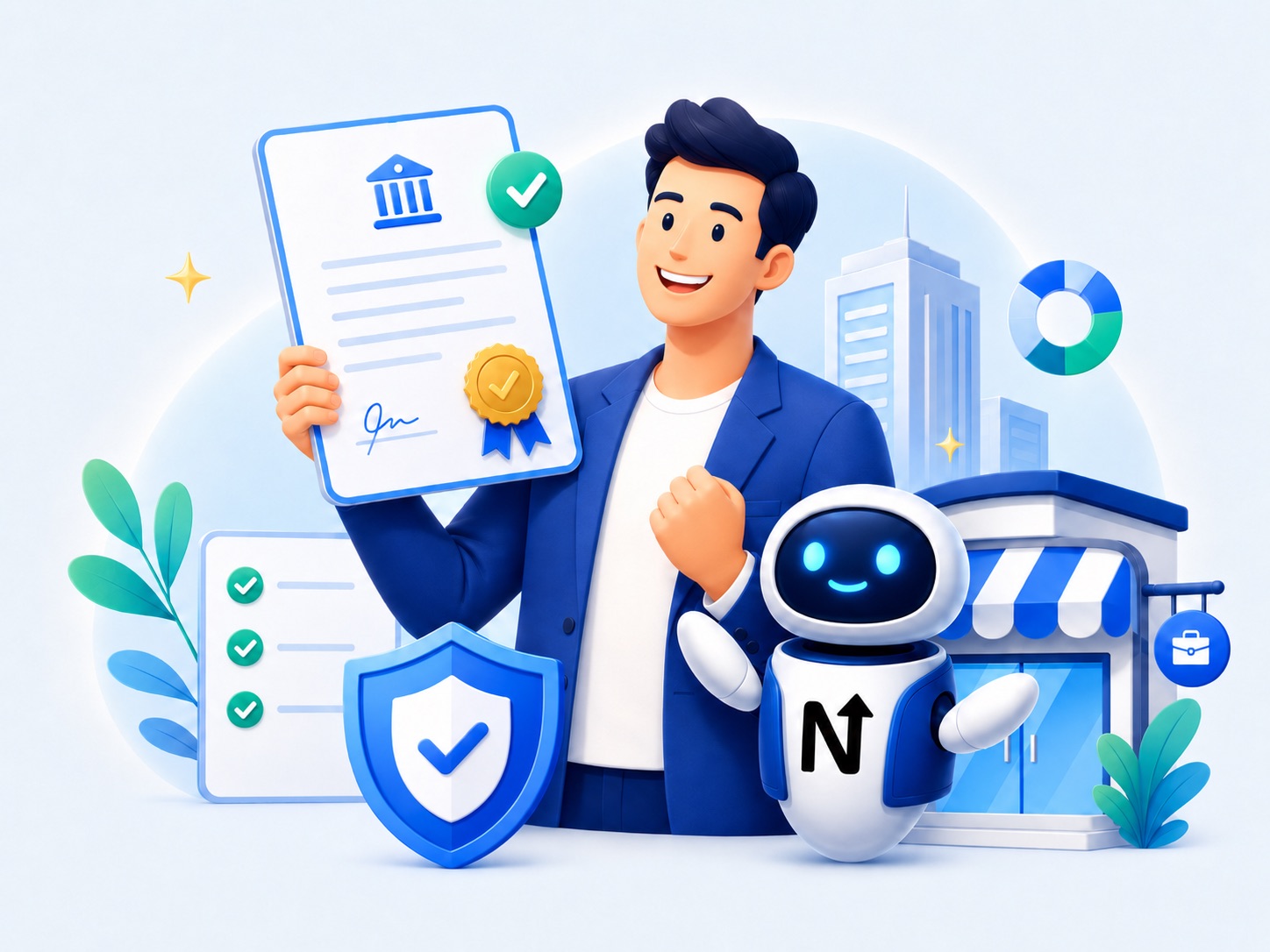
Spin up an LLC, Corporation or similar entity through vetted formation partners - paperwork, EIN and registered agent in one flow.
Form your business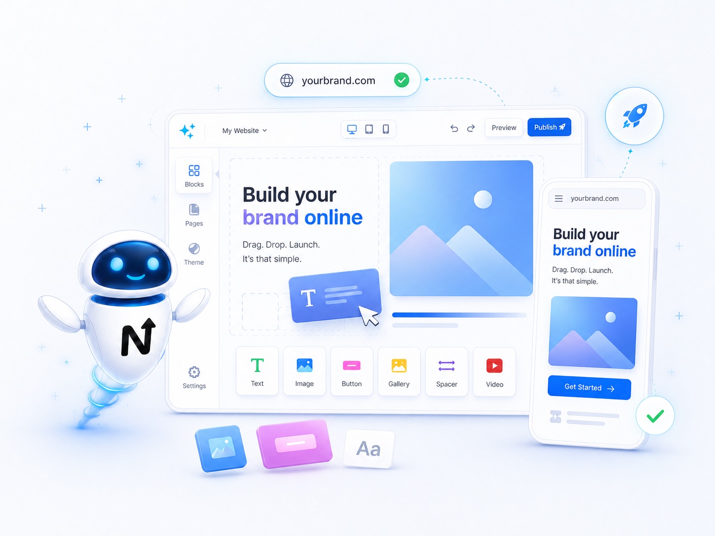
AI website builders with drag-and-drop editing turn a simple prompt into a live, mobile-ready brand site in minutes - no developer required.
Build a website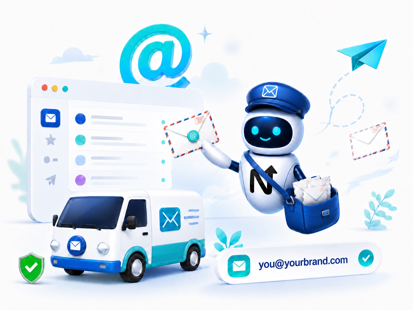
you@yourbrand.com on enterprise-grade email, set up the moment you own the domain. Calendar, drive and meetings included.
Set up emailStart with the partner that matches your stage and budget. Same vendors and offers we send people to inside the workspace - just available without picking a name first.